
The Connection Between Responsive Design and SEO
A responsive website ensures a seamless experience across devices, directly impacting SEO rankings. Google prioritizes mobile-friendly websites, making responsive design crucial for better visibility and user engagement. If your website isn’t mobile-optimized, consider website development to enhance performance.
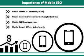
Key SEO Benefits of Responsive Design
1. Improves Mobile Rankings
- Google’s mobile-first indexing ranks mobile-friendly sites higher.
- Enhances user experience (UX), reducing bounce rates.
- Avoids issues with separate mobile and desktop URLs.
- Learn more about SEO optimization to improve rankings.
2. Boosts Page Load Speed
- Responsive sites load faster on all devices.
- Optimized images and efficient coding improve speed.
- Faster loading times contribute to better SEO rankings.
- Consider Google Ads for improved website performance and visibility.
3. Enhances User Experience and Engagement
- Provides a consistent layout across screen sizes.
- Reduces the need for zooming, scrolling, or resizing.
- Better engagement leads to higher conversions.
- Need content that keeps users engaged? Check out content writing services.

4. Reduces Duplicate Content Issues
- No need for separate mobile and desktop versions.
- Prevents duplicate content penalties from Google.
- Consolidates link equity, improving SEO authority.
- For local search improvements, explore Local SEO strategies.
5. Supports Local SEO
- Mobile-friendly design improves Google My Business rankings.
- Enhances click-through rates (CTR) from local searches.
- Boosts traffic from location-based searches.
How to Optimize for a Responsive Design
- Use mobile-friendly themes and frameworks.
- Optimize images and minimize large scripts.
- Implement fluid grids and flexible layouts.
- Ensure touch-friendly navigation for mobile users.
Common Mistakes That Hurt Responsive SEO
- Using fixed-width layouts that don’t adapt to screens.
- Blocking CSS, JavaScript, or images, affecting rendering.
- Slow mobile loading speeds due to heavy elements.
- Unoptimized pop-ups that disrupt user experience.
Final Thoughts
A responsive design enhances both SEO rankings and user experience. If your website isn’t mobile-optimized, it’s time to upgrade! Let Social Media Max help you create an SEO-friendly, fully responsive website.
📞 Call us at 0161 399 3517
📧 Email: Syed_66@hotmail.com
🌐 Visit: Social Media Max