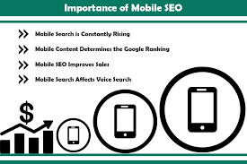
Why Mobile Optimization Matters
With more than 60% of internet traffic coming from mobile devices, a slow or poorly designed mobile site can cost you visitors and conversions. A well-optimized mobile site ensures faster load times, smooth navigation, and a better user experience—which leads to higher engagement and sales.
If your mobile site isn’t performing well, our Website Development Services can help you build a responsive and fast-loading website.
1. Make Your Website Mobile-Responsive
A mobile-responsive design adjusts to different screen sizes automatically. This prevents:
✅ Text from being too small to read
✅ Buttons from being difficult to click
✅ Images from breaking the layout
Want a seamless user experience across all devices? Our SEO Services ensure that your site is Google-friendly and fully optimized.
2. Improve Page Load Speed
Slow websites drive users away! To speed up your mobile site:
✅ Optimize images (compress large files)
✅ Minimize CSS and JavaScript (remove unnecessary code)
✅ Use a fast hosting provider
Not sure if your site is fast enough? Try our Local SEO Services to boost your mobile performance and visibility.
3. Use a Mobile-Friendly Navigation Menu
A cluttered menu can frustrate users. Make sure your navigation is:
✅ Simple and easy to use
✅ Accessible with one thumb
✅ Clear with large buttons
4. Optimize for Touchscreen Usability
Since mobile users rely on touch, you should:
✅ Use large buttons (at least 48×48 pixels)
✅ Space out clickable elements
✅ Ensure easy scrolling and swiping
5. Implement Accelerated Mobile Pages (AMP)
AMP is a Google-backed framework that speeds up mobile pages by removing unnecessary code. This results in:
✅ Faster load times
✅ Better rankings on Google
✅ Higher mobile conversions
6. Improve Readability and Font Size
Text that’s too small is hard to read on mobile. To improve readability:
✅ Use a font size of at least 16px
✅ Keep paragraphs short and scannable
✅ Use bullet points for better structure
Need help crafting clear and engaging content? Our Content Writing Services ensure that your message is easy to read on any device.
7. Test and Optimize Your Mobile UX Regularly
Regular testing helps identify issues before they drive users away. Use:
✅ Google’s Mobile-Friendly Test
✅ A/B Testing to compare different layouts
✅ User feedback to make continuous improvements
Enhance Your Mobile UX with Social Media Max!
A well-optimized mobile site means better rankings, more conversions, and happy users. If you want to improve your website’s mobile experience, let’s work together!
📞 Call us: 0161 399 3517
📧 Email: Syed_66@hotmail.com
🌐 Visit: Social Media Max